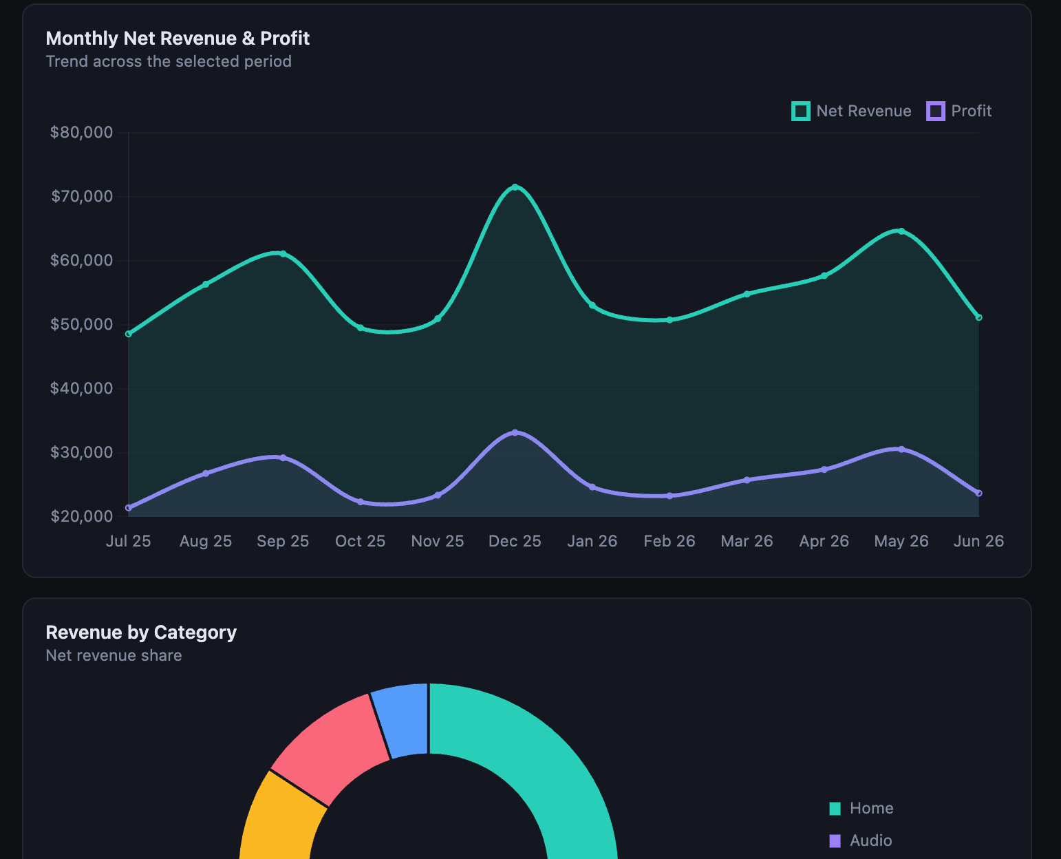
About 18 months ago, I gave my team a fairly unglamorous task: work out which AI tool we could actually trust with our spreadsheets. Not for writing emails or summarising meetings, but for the messier job of pulling insight out of the kind of complicated, multi-tab, slightly-cursed spreadsheets that every business runs on. At the time, that was a genuinely hard bar to clear. Every tool we tried would confidently misread a column, invent a trend that wasn't there, or quietly drop half the rows without saying so. Numbers are unforgiving. Get the prose wrong and nobody notices. Get the numbers wrong and you make a bad decision with total confidence.
We didn't give up on the idea, but we didn't fully trust it either. A small learning group within the team kept tracking the improvements with each new model release, testing the latest one against a real spreadsheet every few months — and each time, someone still ended up double-checking every number it produced. Spreadsheets stayed spreadsheets, and dashboards stayed the job of whoever had the patience to build a pivot table.
Then a few weeks ago I came across an Instagram post that changed my mind about where things had got to. The creator, Georgie Barrat, was sharing a single prompt she'd been using with Claude — and the dashboards it produced:
That's it. No specifying which columns matter, no describing the chart types, no telling it what the data means. You upload the file and let Claude work out the story itself. A commenter on the post summed up why this version of the prompt works better than the obvious one: you get better results letting Claude read the data first, rather than telling it what to build before it's even looked.
I tried it that evening, out of curiosity more than expectation. I've since built several interactive dashboards for work off the back of it, and none of them took more than twenty minutes — including the time spent tweaking colours and asking for a different chart type. That's not a small claim. Twenty minutes is roughly how long it takes to make a decent coffee and explain to a colleague why the quarterly numbers look odd. It's not how long dashboards are supposed to take.
What Are Claude's Artifacts?
The dashboards themselves show up in something called an artifact — a separate panel that opens next to the conversation and holds whatever substantial piece of work Claude has produced. Rather than pasting a wall of code or a static image into the chat, Claude builds the thing as a live, interactive app: a working piece of software you can click through, not a picture of one. Artifacts can be code, documents, diagrams or, in this case, fully interactive React components with real charts, tabs and filters.
The useful part for spreadsheet work is that the artifact stays open and editable. If a chart isn't quite right, you just ask for it to change — a different chart type, a new colour theme, another tab for a second data set — and Claude updates the same artifact rather than starting over. You can flick between versions if an earlier attempt was actually better, and once you're happy with it, you can share or embed the finished dashboard. Artifacts are available on Claude's Free, Pro, Max, Team and Enterprise plans, with code execution and file creation switched on in settings, and they work the same way whether you're on the web, desktop or mobile app.
What struck me wasn't the novelty of "AI makes a chart" — plenty of tools have done that for years. It's that the output looks considered. The charts default to a clean, legible design rather than the harsh primary colours and chart-junk that so much auto-generated data visualisation ends up with. Claude seems to be applying real judgement about which chart type suits which kind of data, rather than defaulting to a bar chart for everything.
Try It Yourself
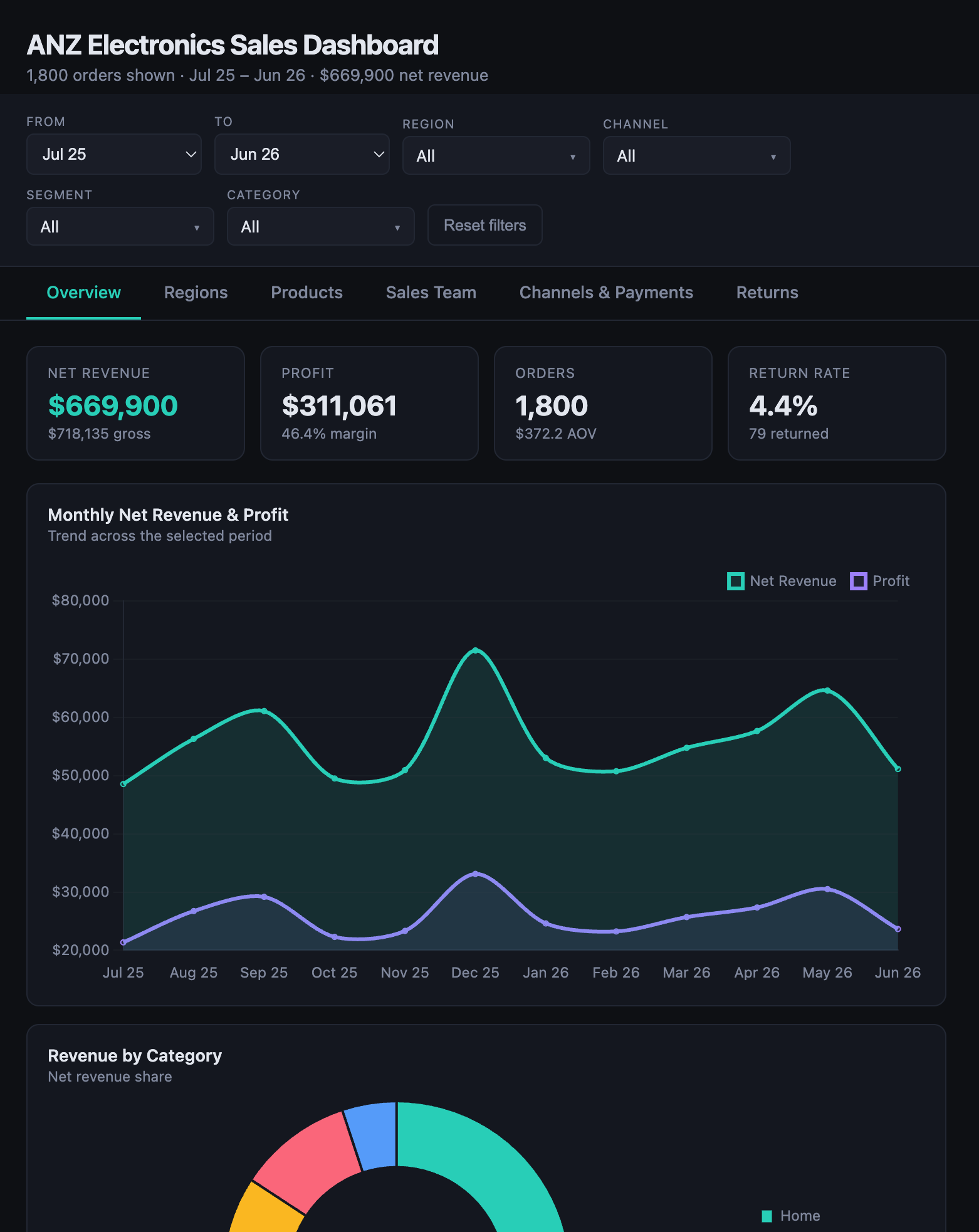
Since real work data isn't something I can publish, I've put together a dummy sales dataset that has enough going on to be interesting: eighteen hundred orders across six cities in New Zealand and Australia, five product categories, three sales channels, discounts, returns and a full year of seasonal swings. It's messy enough to be a fair test and clean enough that you'll be able to tell if Claude has understood it correctly.
Upload it to Claude with the prompt above and see what comes back. A few things worth watching for: whether it picks up on the seasonal spike around November and December, whether it separates the three sales channels sensibly, and whether it flags the return rate as something worth a closer look. In my experience it catches all three without being asked.
Is This the End of Looker Studio?
I don't think Google's Looker Studio or the heavier business intelligence platforms are going anywhere immediately — they're built for live data connections, scheduled refreshes, permissions and the kind of governance that a large organisation needs before it lets a dashboard near a board meeting. Claude isn't plugged into your data warehouse and it isn't refreshing itself overnight.
But that's not really the job most people need done most of the time. Most of the time, someone just needs to understand what a spreadsheet is telling them, right now, without waiting on a data team or learning a new tool. That's the job Claude is already very good at, and it does it faster than anything I've used before. If it keeps improving at connecting directly to live corporate data sources, the gap between "quick personal dashboard" and "proper BI platform" gets a lot smaller than it's been for the fifteen or so years these tools have existed.
What I like most about where this has landed is who it puts the capability in front of. Building a dashboard used to mean knowing a query language, a BI tool, or at minimum someone who did. Now it's a prompt and a file upload. Managers who've never opened a pivot table can ask their own questions of their own data and get an answer they can actually explore, at the speed the question occurred to them. In a year when the speed of insight matters more than it ever has, that's a genuinely useful shift, and it's one I expect a lot more people to stumble onto the same way I did — scrolling past it on Instagram, trying it out of curiosity, and being surprised by how well it works.